Riverbank is a fintech app designed for young adults to keep track of their spendings and money. Riverbank gives them the facts about their finances and helps them to get a handle on budgeting, spending, and saving for the future.
September 2022 to September 2022
Research, Ideation, UI Design, Prototyping
Figma, Adobe Illustrator
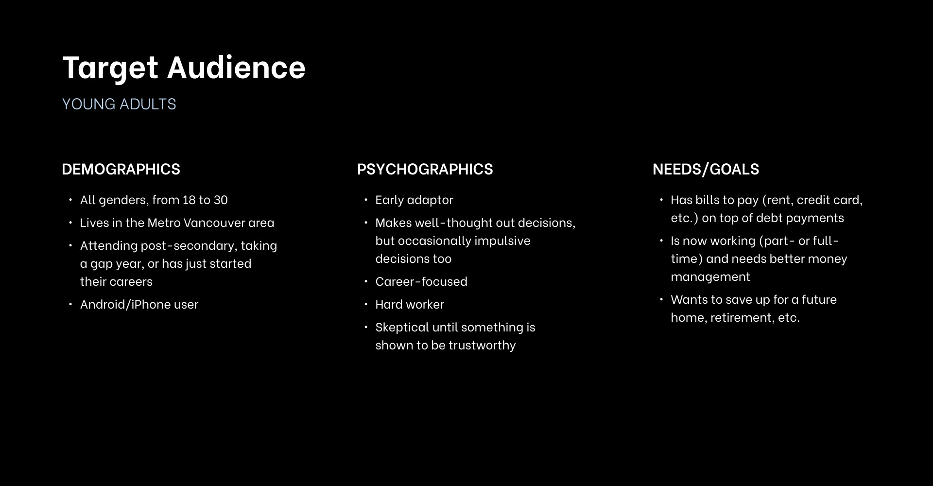
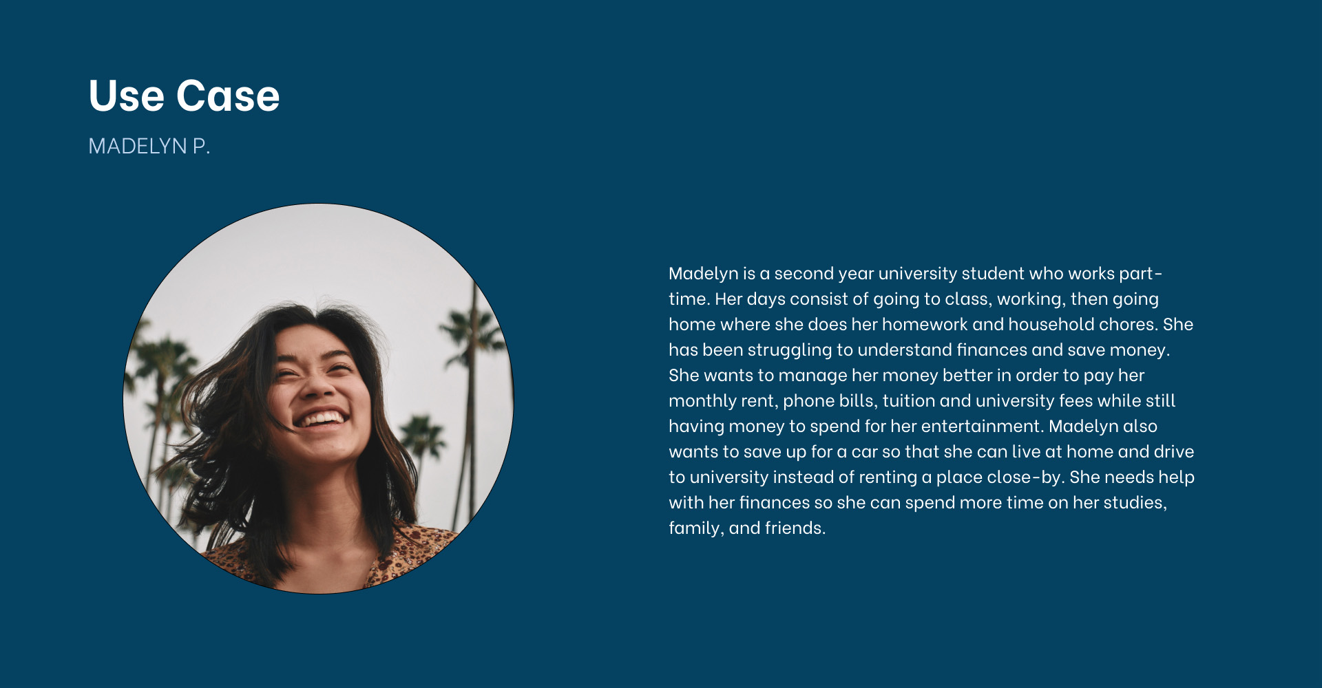
This student project had a focus on UI design so I did some research into my target audience—young adults—before getting into the design.
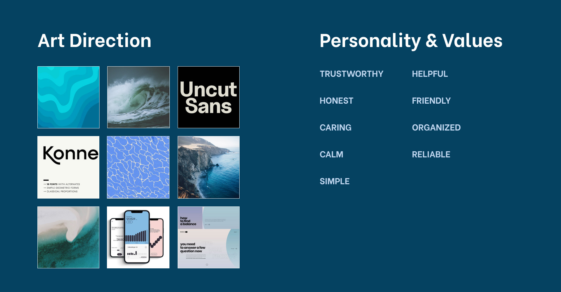
How exactly did the idea of fish and water come about for this fintech app? It all started with the idea of finding a fun and unique name for this project. Suddenly, a fish joke heard from a very long time ago sprung into mind. The joke goes like this: Where do fish keep their money?
In a riverbank!
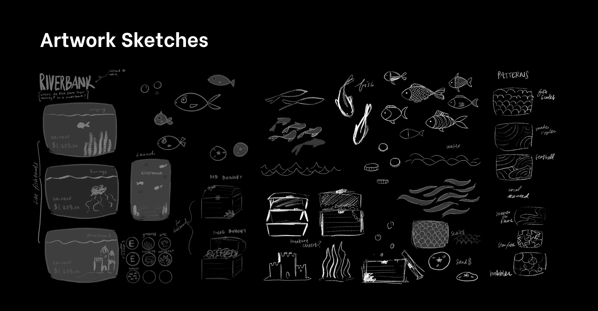
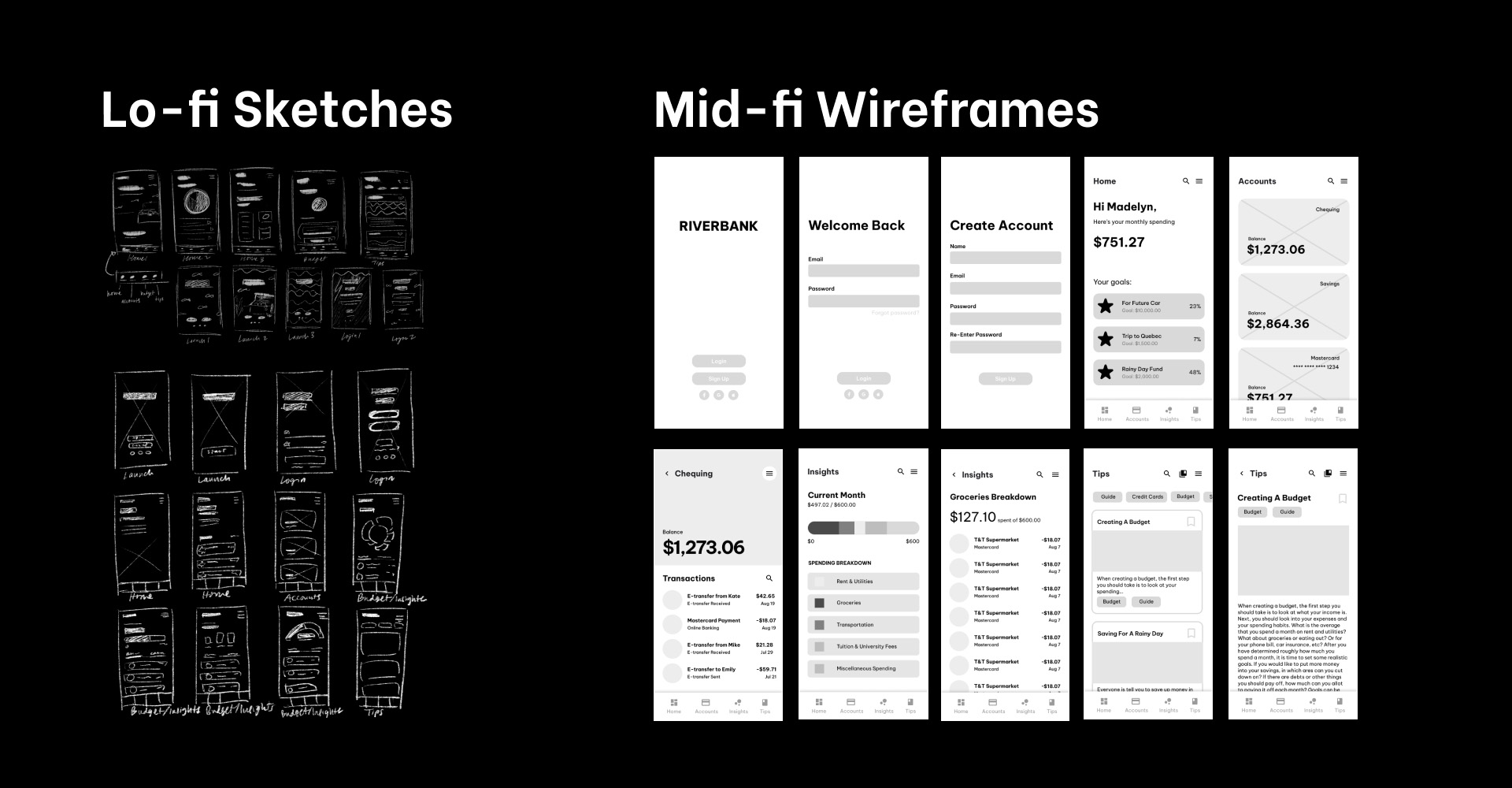
The "aha!" moment came when sketching the visual elements. Many of the first sketches were literal depictions of fish, waves, sand castles, and other water-related objects. The vision for those sketches made the fintech app seem too juvenile when the target audience was young adults.
More sketching led to making more abstract and patterned visual elements which better fit the target audience.
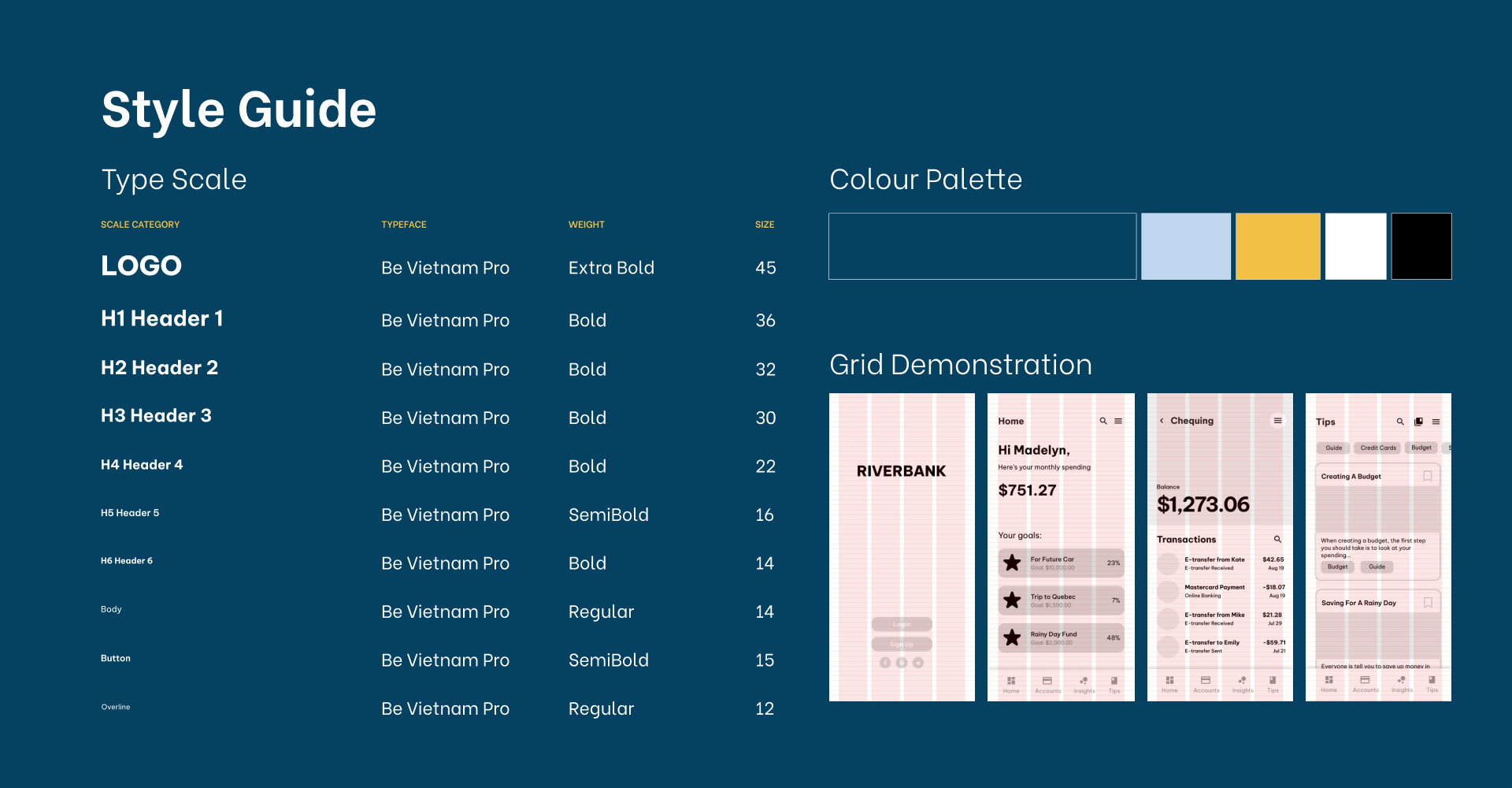
It may seem obvious to have blue for a fintech app named Riverbank, but that was not my initial direction. Although not pictured in this case study, my first mood board and colour palettes used yellows and greens. It made the interface look washed out and didn’t get the theme of the app across. Changing the colour palette to be mainly blue made a dramatic difference.
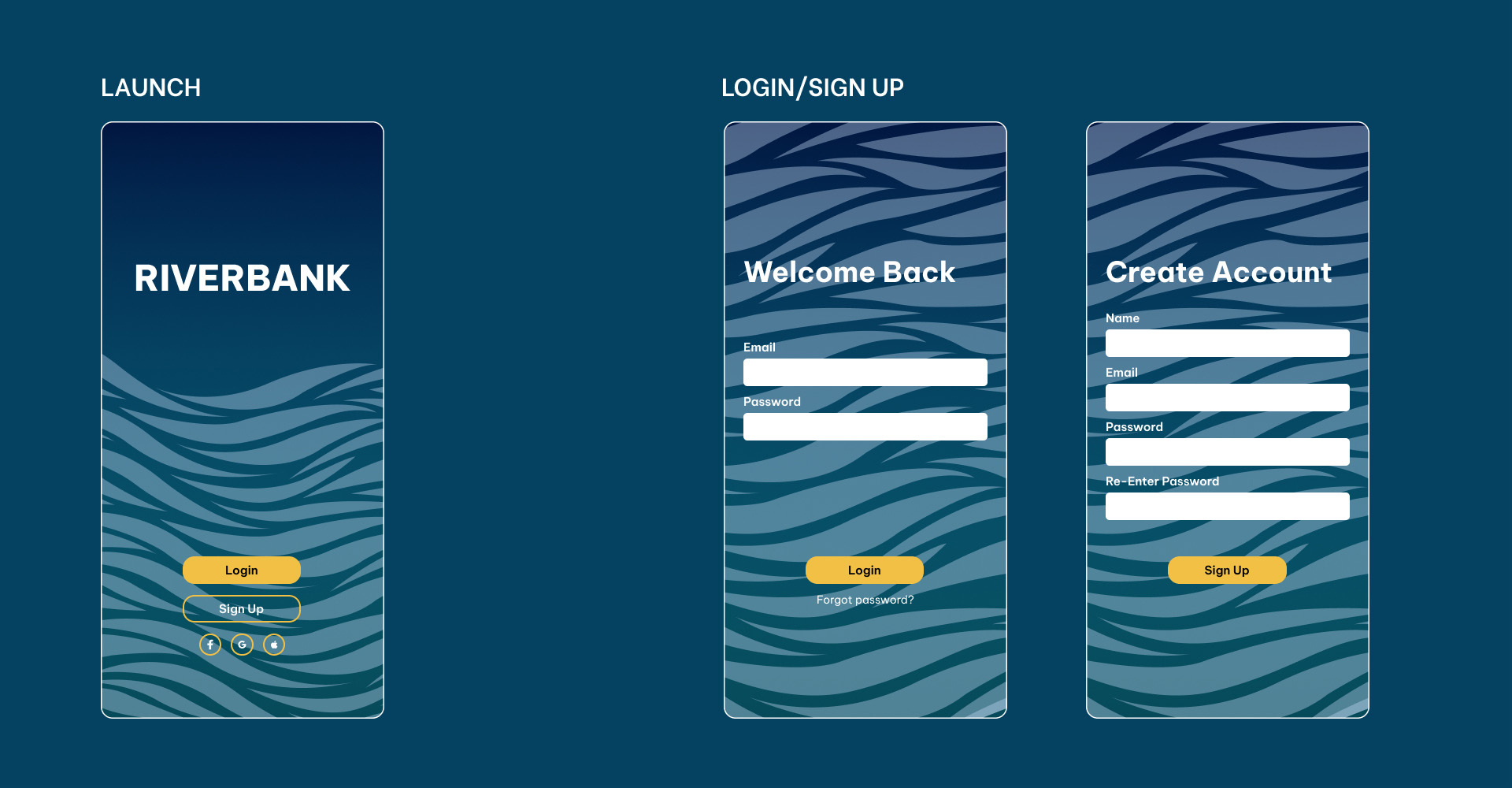
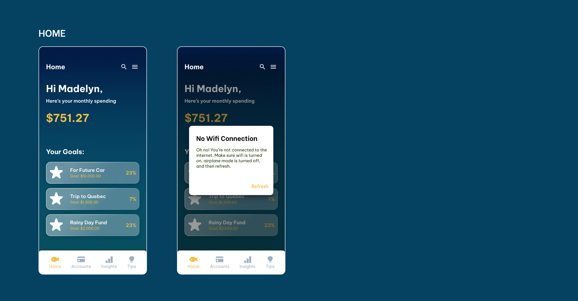
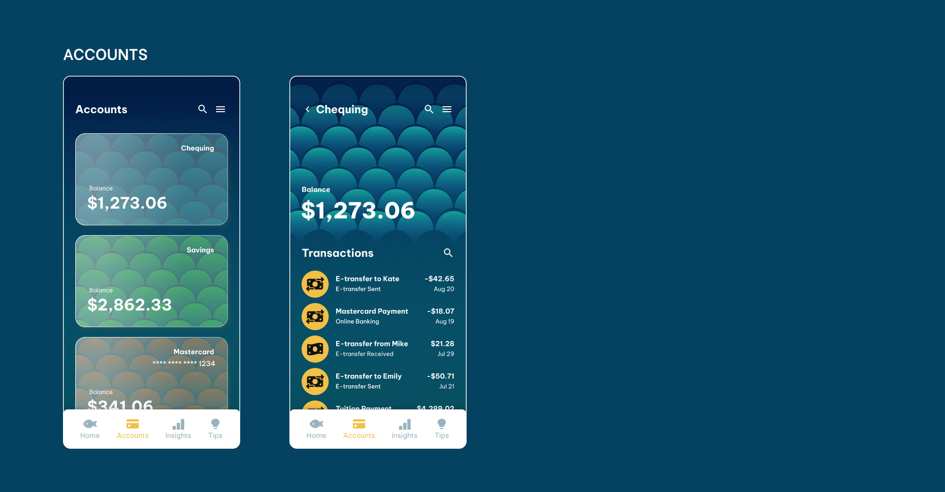
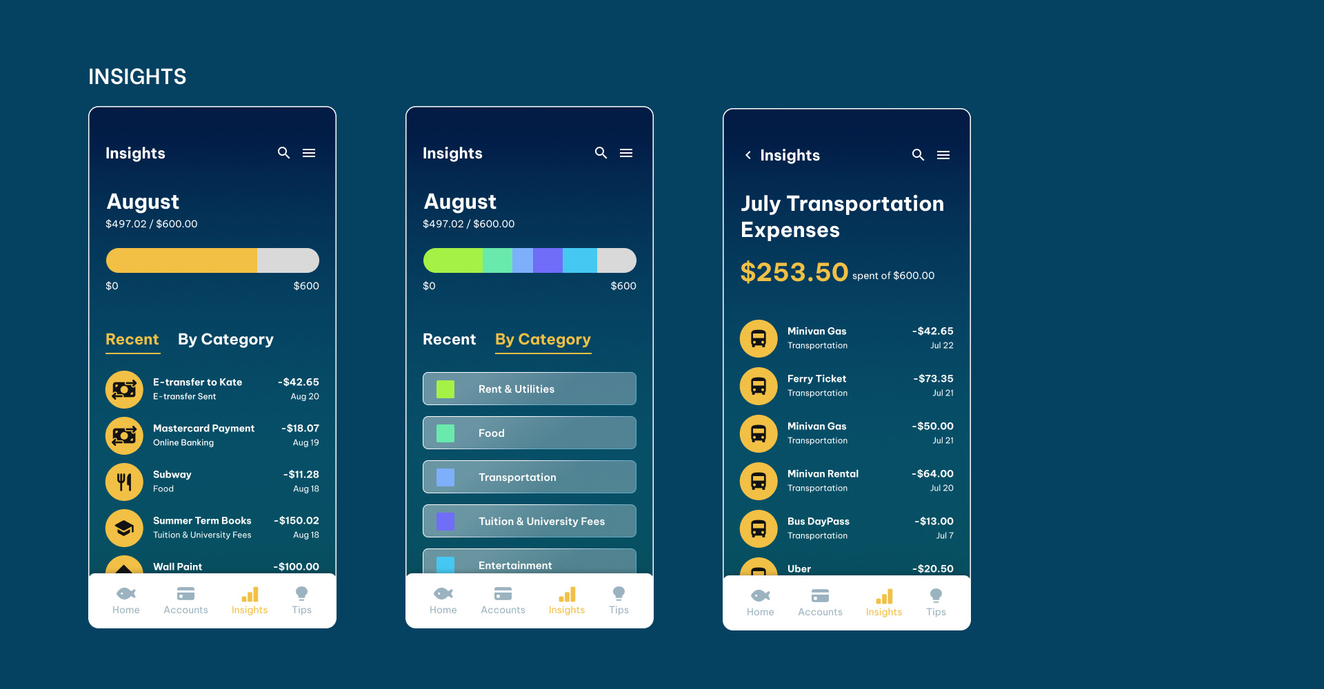
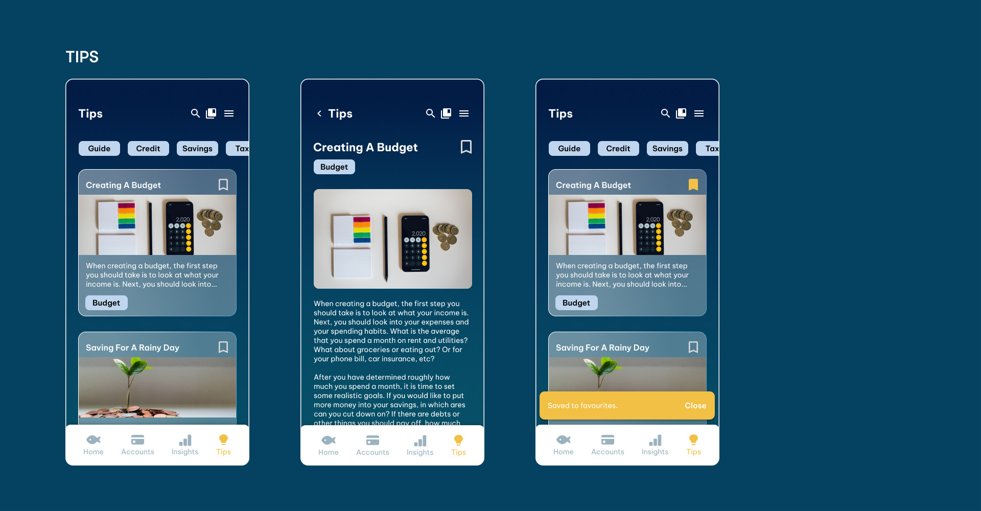
This project allowed me to practice creating a compelling and consistent UI. It brought me through the very initial steps of defining a target audience and art direction all the way to the final interface. Along the way, I was able to exercise my skills with grid systems, typographic hierarchy, and UI components. I also learned the importance of constantly checking to see how everything looked on an actual mobile screen as I worked.
In the short amount of time I had to create this fintech app, I'm quite happy with the work I produced. If I were to do this project again in the future, or if I were to work on it further, I would like to add motion into the illustrative elements of the app and prototype it as well.
Thank you for making it to the end of this case study!