Many high school students are uncertain about what to do after graduation. Shape helps them explore potential career paths based on their interests, talents, and skills. The mentor feature lets students see what work might look like in multiple occupations.
2024 RGD Student Award, UX Design Honourable Mention
2023
Research, Ideation, Branding, Logo Design, UX/UI Design
Figma, Procreate, Illustrator
Nathan Ng @ Engine Digital
Scott Strathern @ Engine Digital
A lot of pressure is put on high school students to decide what their plans are after graduating. This makes them go through uncertainty and doubt as they try to make up their minds about what career options and post-secondary options to pursue.
To design a mobile app that informs, inspires, and guides high school students in grades 10 to 12 (aged 15 to 18) to make a decision about different career options, post-secondary options, and trades available to them after graduation.
After doing the initial round of secondary research, I drew up primary interview questions which were all validated by an industry strategist. Then, the unfortunate news came that we weren’t allowed to conduct any primary research interviews. So, we didn’t.
The interview questions were then used for another round of secondary research. This time, I looked at online forums, academic articles, and also asked the questions to myself, and remembered past conversations, in order to find answers for them.
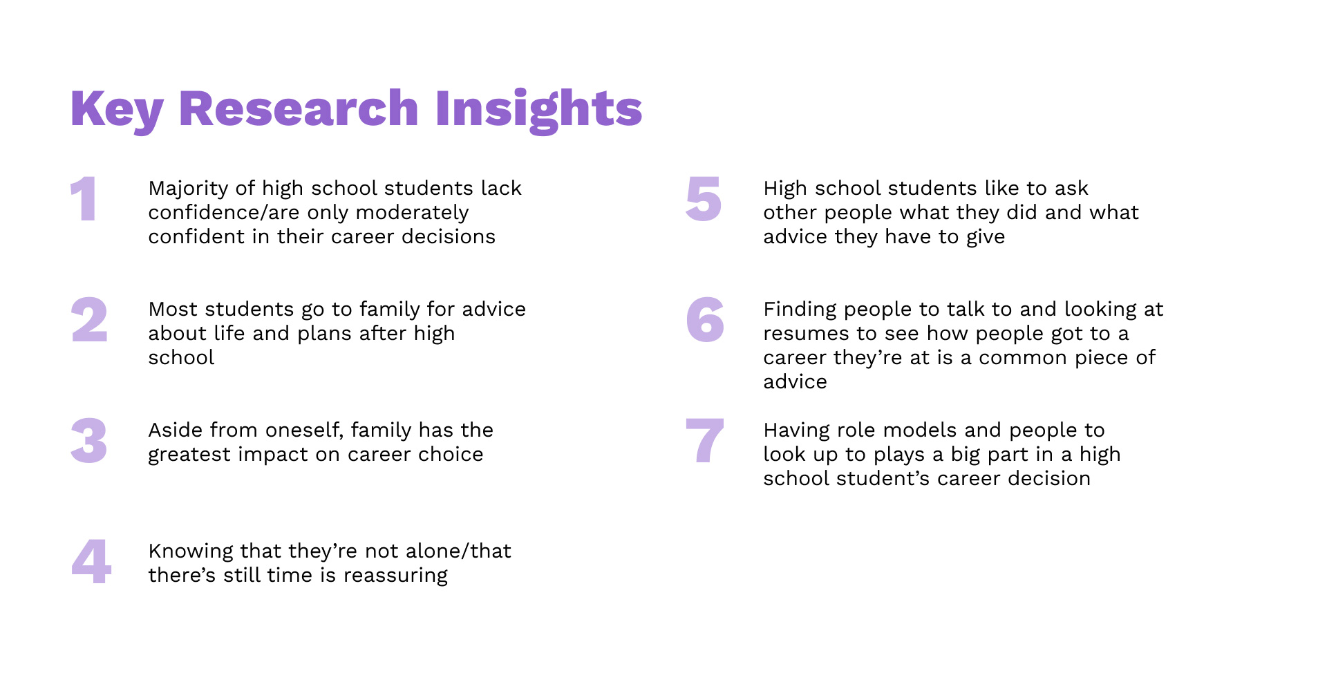
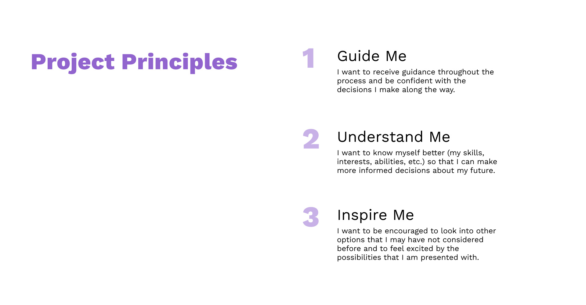
For the secondary research, I also looked at a lot of statistics, surveys, and polls. Once enough information had been gathered, 7 key insights were pulled from my research.
These key insights were distilled into into 3 project principles that would be the north star for the project.
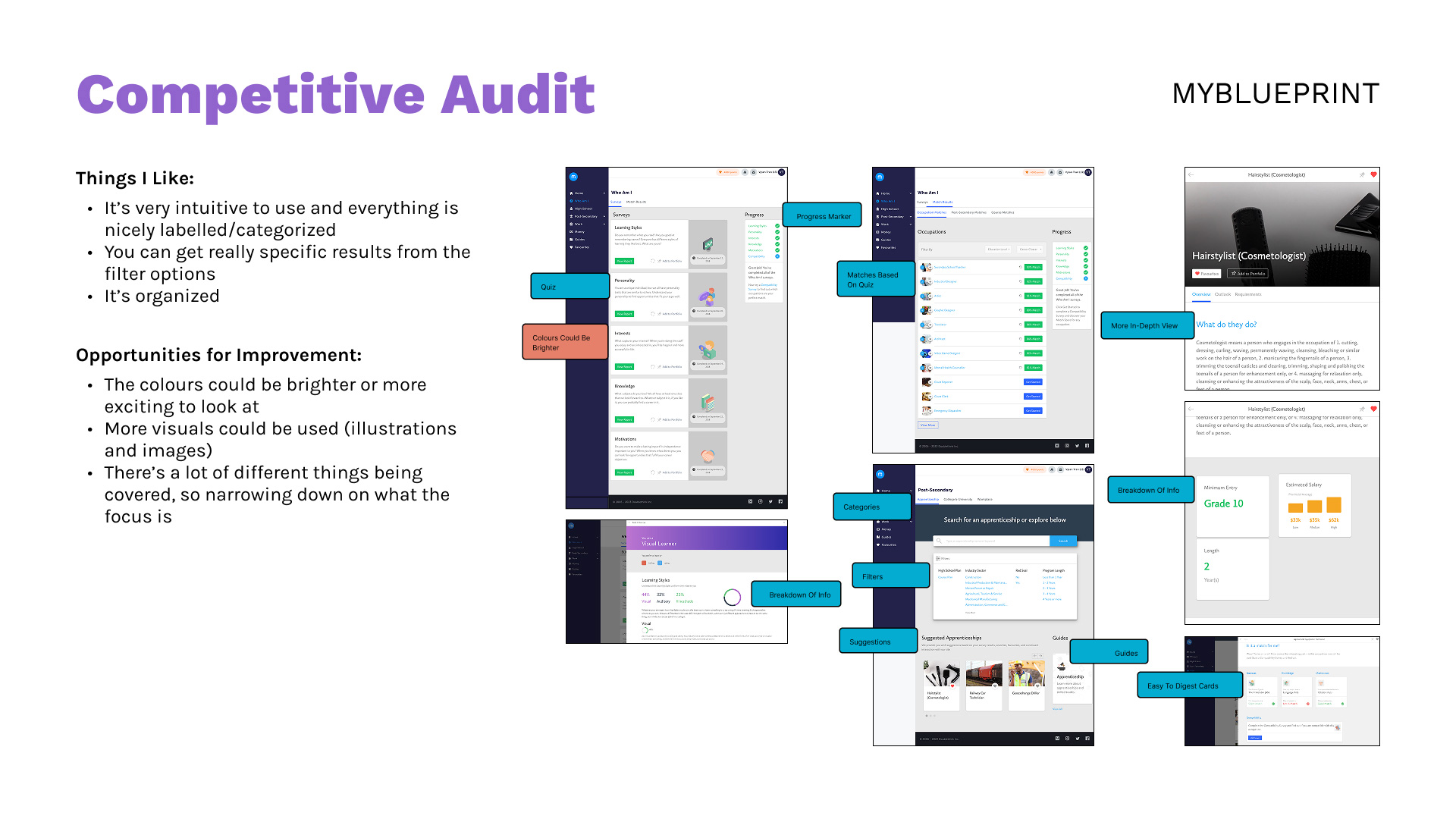
For the competitive audit, I looked at what was already out there. I found that there were a lot of websites (like MyBlueprint, EducationPlannerBC, EngineerGirl, etc.), but not any apps.
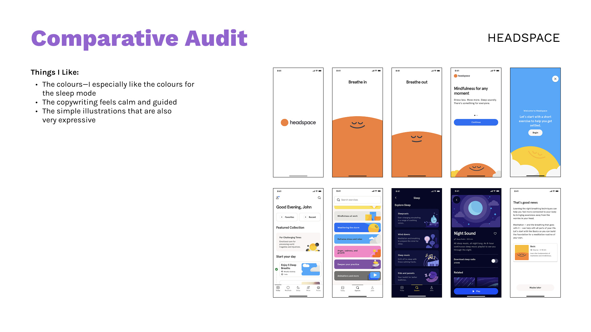
As for the comparative audit, I looked at applications that did a lot of things really well (like Spotify, Duolingo, and Headspace).
For both audits, I looked at what worked and what I liked from what was already out there as well as opportunities and places where there could be improvement.
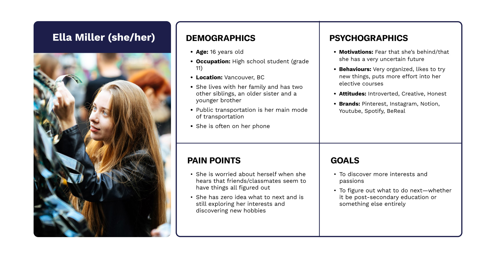
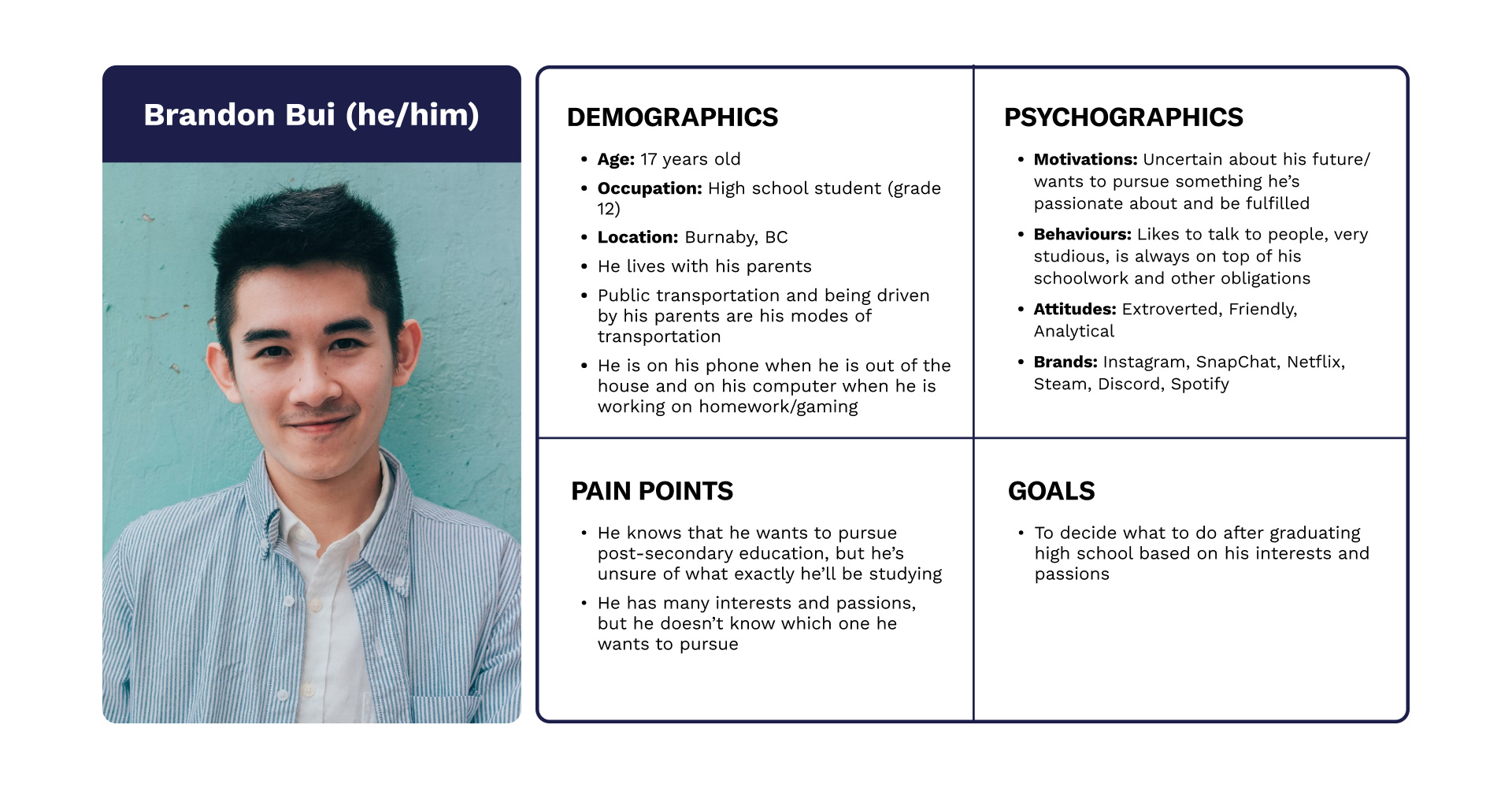
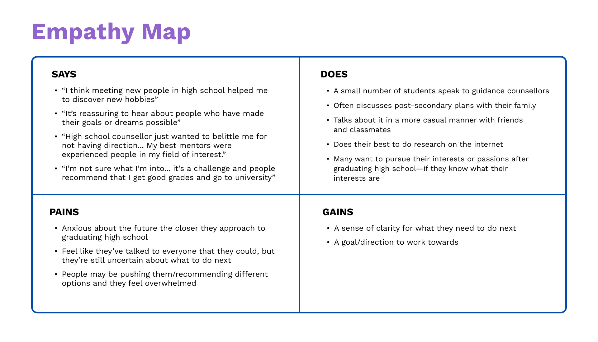
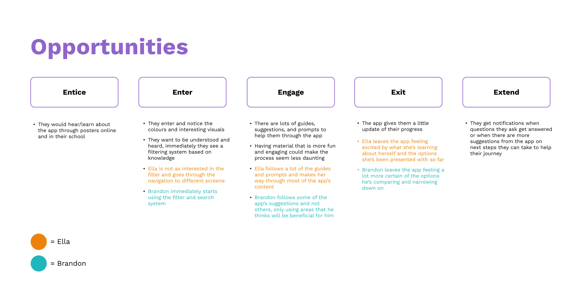
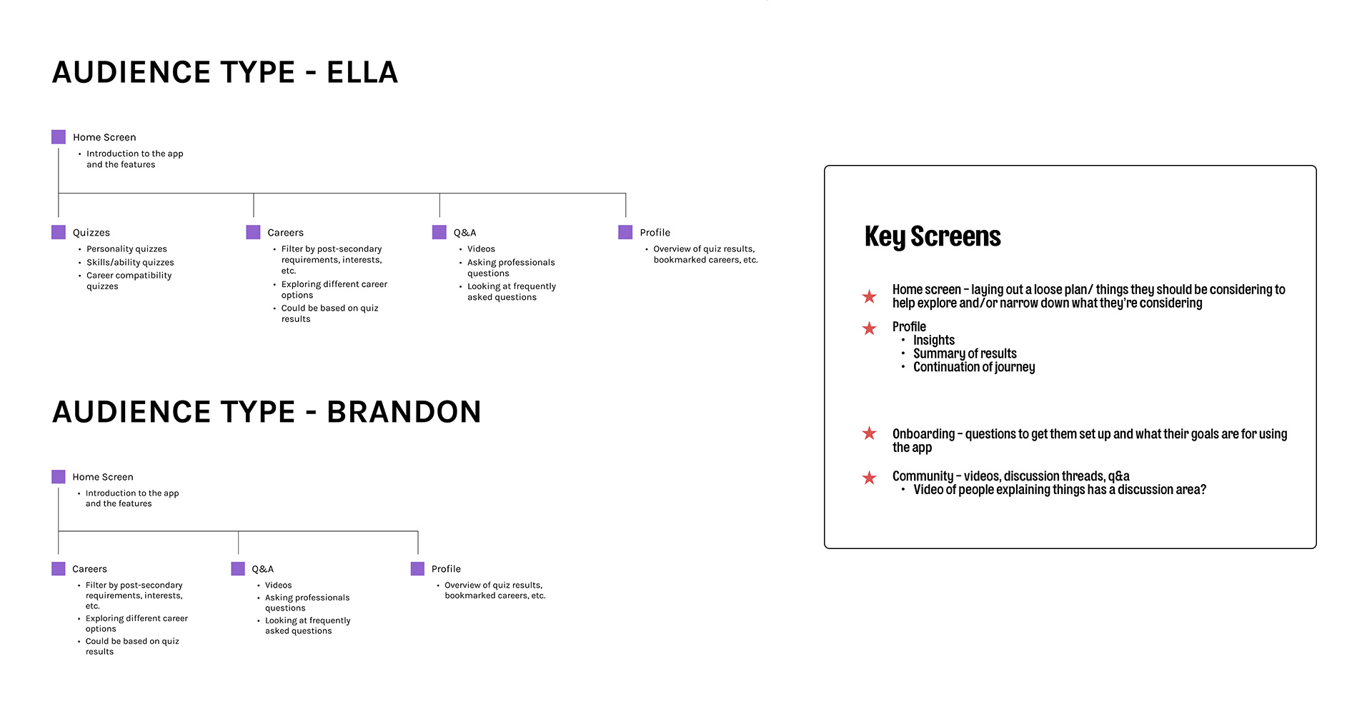
For the strategy part of this project, I created user personas, an empathy map, user journeys, and looked at opportunities by seeing how the two user personas would engage with the app by working through the customer journey 5E’s—entice, enter, engage, exit, and extend.
Aside from working on the UX/UI of this design, another aspect I personally wanted to improve on was creating a strong brand.
We went through many mood board iterations and I sketched out many logo concepts. The logo design process became more streamlined once a simple name that encapsulated the project had been locked down.
With the many project stages we went through, and with some bumps and roadblocks along the way, our deadline for the project was looming before us.
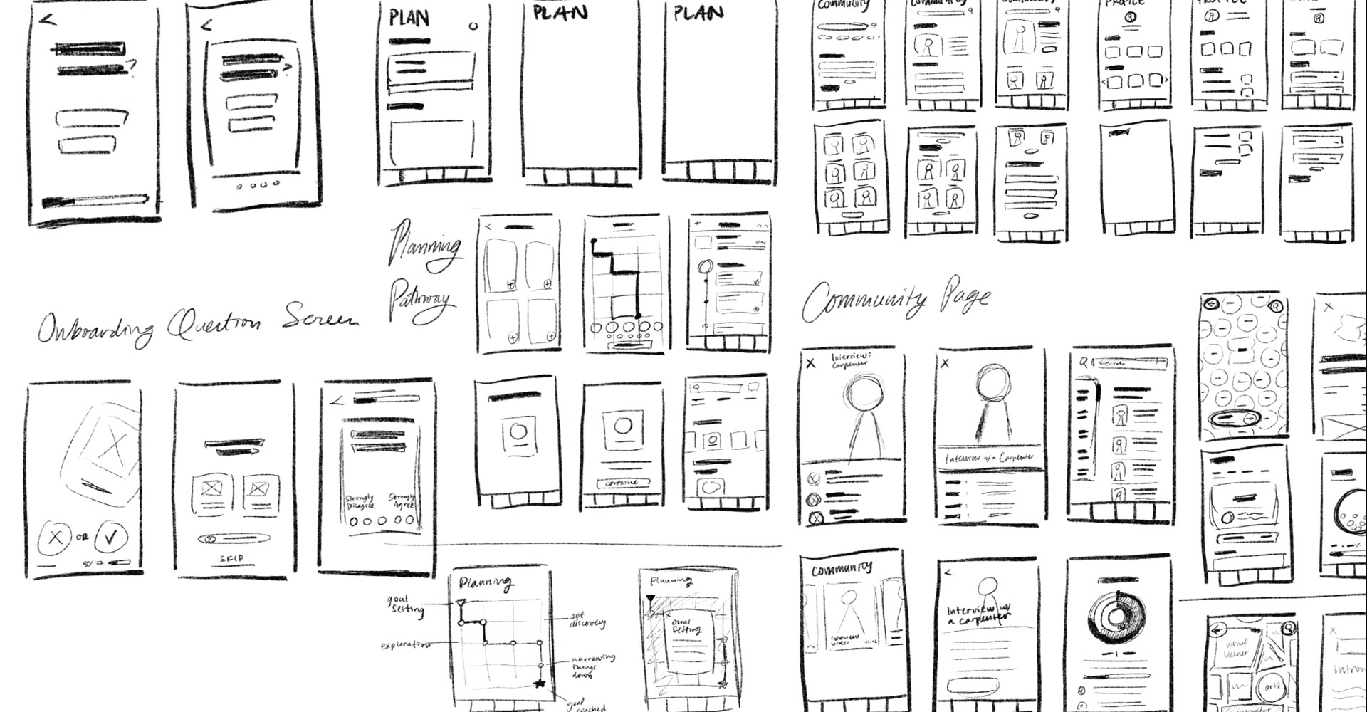
There was no time to build out all the screens, and no time to prototype at all, so we evaluated which screens would be the most important to spend our remaining time and energy designing.
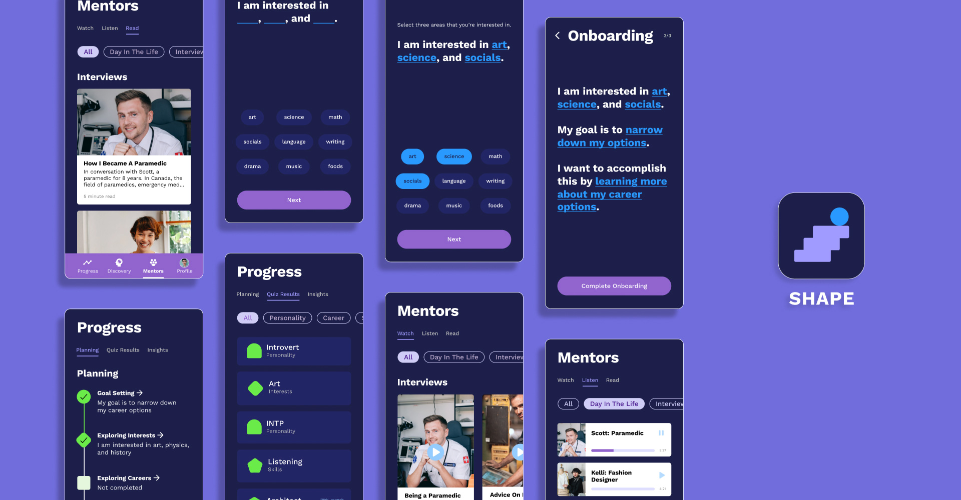
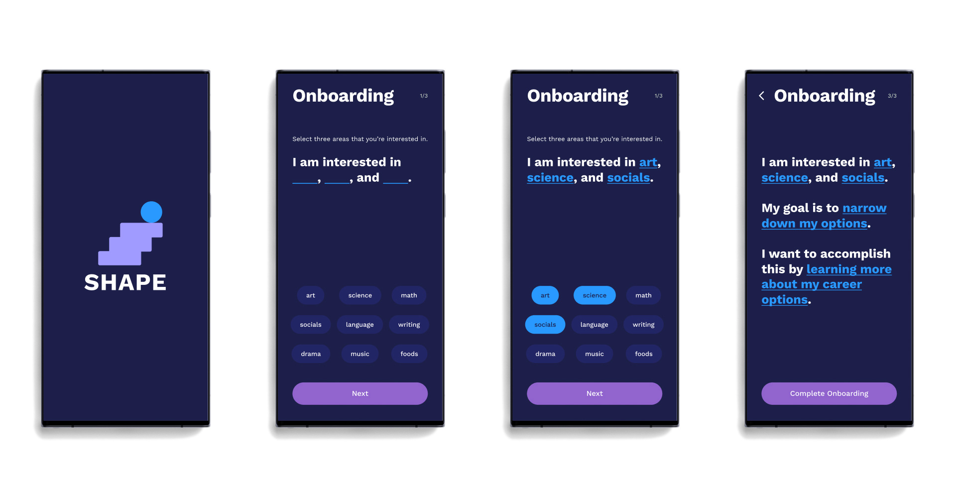
During the onboarding, users are lead through fill-in-the-blank sentences about their interests, goals, and what they want to accomplish. This section informs other parts of the app so that the content would be curated to better fit the user.
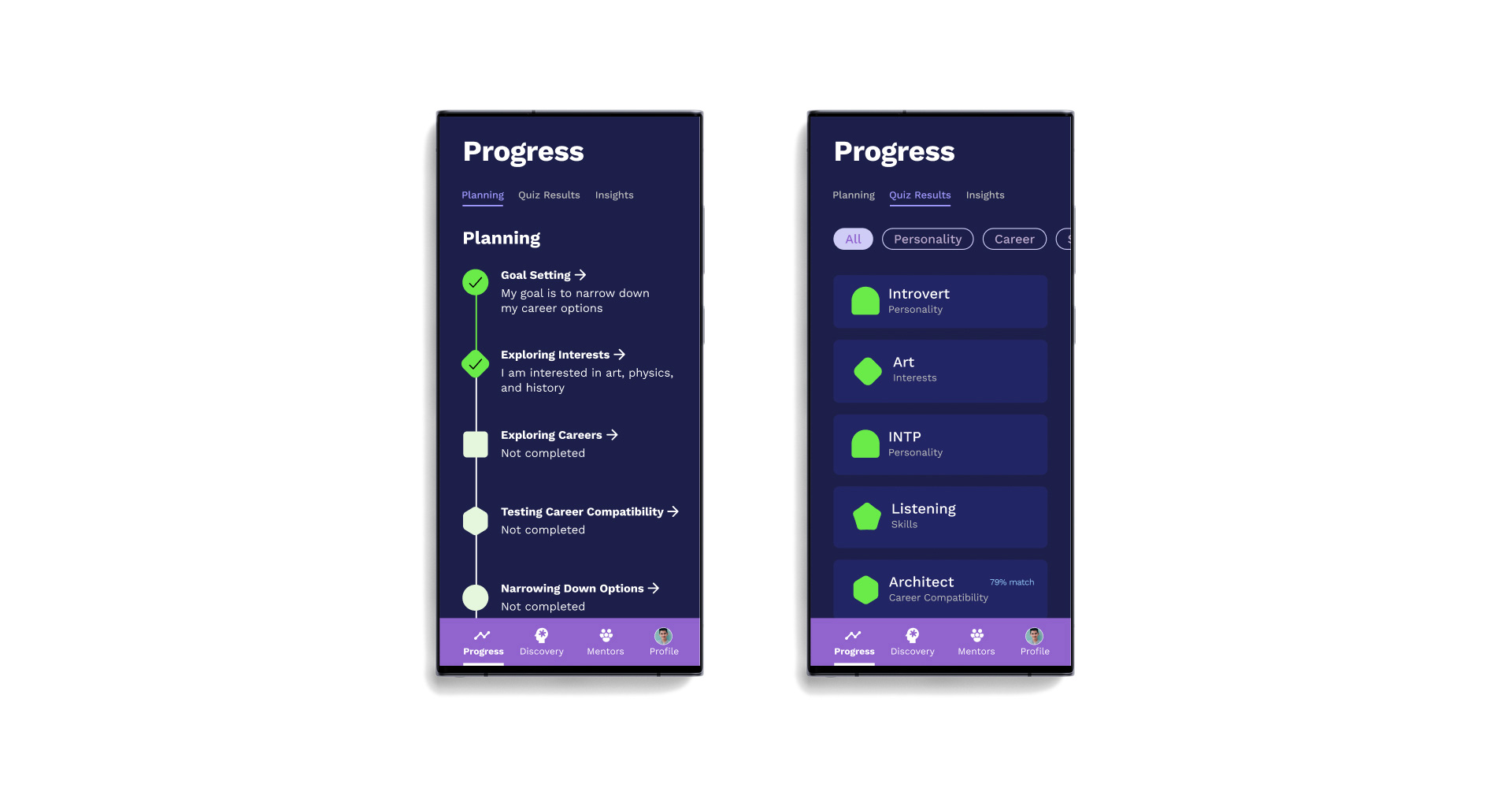
In Progress - Planning, users see an overview of the path they will be taking to get to their goal. Goal setting and exploring interests is already completed because it was done during onboarding. The journey has already started!
Progress - Quiz Results is where users view results from quizzes taken in the Discovery section.
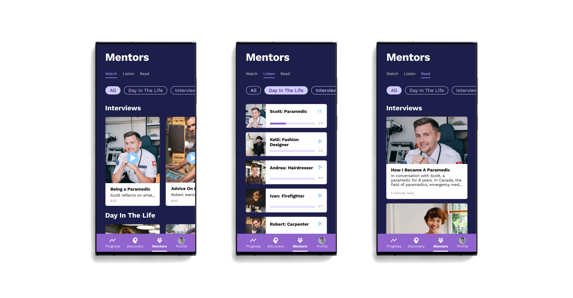
A big part of the research pointed to how getting advice, talking to people, and having role models and people to look up to was an important part of the decision making process.
In Mentors, users can go through interviews, advice, day in the life, personal insights, and more content from people who work in specific jobs.
Moving forward with this project, I would like to create the complete screen set for the app as well as prototype it all and add motion. Additionally, I think it’d be really cool to make a branding package for Shape too.
In the timeframe that I had for this project, I learned a lot. A special thank you to Nathan for all the back and forth collaboration we went through and to Scott for his keen eye on design and critique whenever we had check-ins. This project wouldn’t be what it is without their guidance.
Thank you for making it to the end of this case study!